
White Raven Agency
Nobody reads a website. They skim it. This one had to work that way on purpose.
The Challenge
Here is the uncomfortable truth about any agency site: almost nobody reads it. People scroll fast. They catch a headline, glance at an image, keep moving. Maybe they stop once. For White Raven — an agency whose entire pitch is that details matter — that creates a real problem. Everything worth saying has to land in the few seconds a skimming visitor actually gives you. Not through more copy. Through what they see while moving.
The Solution
So the site got built around skimming instead of against it. Layout, image placement, and entrance animation all point at the same job: make each section legible at a glance, and make the next one worth scrolling to. The services section is the clearest example. As a flat list, four services are something you scroll past in a second and retain nothing from. Built as stacked cards that reveal one at a time, each service gets its own moment on screen — you cannot skim past all four at once, because the page hands them to you individually. Same information. Completely different chance of it registering.
Strategy & Approach
Design lived in Figma, owned end to end by White Raven's creative team — typography, color logic, the raven mark, the tone. The moodboarding and the cutting had already happened there, so this was never a case of stripping back a bloated build. Sensys's side was development and motion direction: reading a static frame alongside the references behind it, and working out what it should actually become in motion. That judgment is most of the work. A design can be right and the motion still wrong — too fast, too eager, breaking a visitor's flow at the wrong moment.

Visual Direction
The homepage does not stay one color. As each service arrives — Brand Strategy, Visual Identity, Website, Brand Assets — the background shifts into a new saturated tone. For someone skimming, that shift does real work: color changing underneath you is impossible to miss at speed, and it marks where one idea ends and the next begins without anyone having to read a heading to find out.
User Experience
Ten-plus pages — Home, About, Services, Work, and four dedicated service-tier landing pages — read as one continuous site rather than a set of separate ones. Lenis-driven smooth scroll carries momentum across sections instead of resetting at every boundary, which matters more than it sounds. A scroll that stutters is a scroll people abandon.
Interaction & Motion
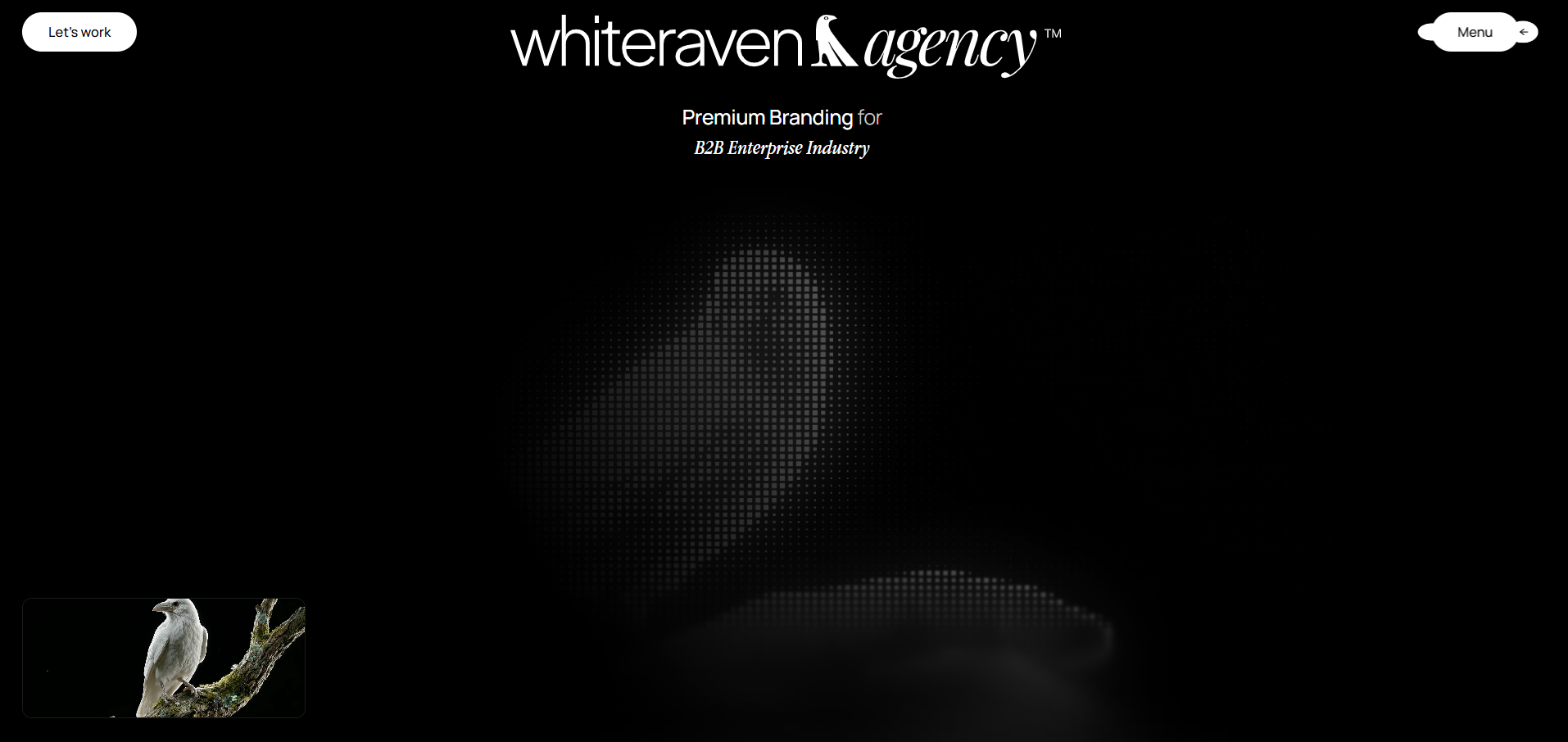
Every animation here answers the same question: does this help someone moving fast? Kinetic text pulls the eye toward a headline worth stopping for. Stacked cards slow the services section down just enough to register. Hover-triggered previews hand control to the visitor instead of playing video at them. The hero video's picture-in-picture only activates on scroll, because motion nobody asked for is just noise.

Development
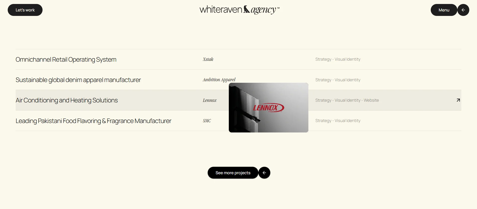
Next.js 16 and React 19 underneath, GSAP and ScrollTrigger driving the animation layer, Lenis for scroll. The most reusable piece isn't any single animation — it's the case-study template. Client work (Xstak, Ambition Apparel, Lennox, SMC) runs through one dynamic system built to hold full-bleed slide galleries, so a new case study is a content update, not a development request. Sanity CMS runs the blog; a multi-step lead form qualifies incoming requests by project type and budget before they reach an inbox.
Challenges
Building the animations was never the hard part. Judging them was. There is no rule that tells you the right moment to interrupt someone mid-scroll — trigger it early and the page feels like it is rushing you, trigger it late and the moment has already passed. That only gets solved by building it, watching it, and revising until it sits right. It takes an eye rather than a spec, which is why it took a few passes on both sides to land.
Execution & Timeline
Scoped upfront as a system built to grow, not just enough pages for launch. That scalability is already in use — four additional landing pages shipped since the original build, each one fitting the existing structure instead of forcing a rebuild.
Results
What came together is a site that holds someone who never intended to stop. A visitor can scroll the homepage end to end without reading a full sentence and still come away knowing what White Raven does, who they do it for, and the standard they hold themselves to — carried by colour shifts, one service at a time, and images placed where the eye already is. The structure held up too. Four service-tier landing pages have shipped since launch, each one slotting into the existing system rather than needing its own build. The site the agency has today is the one they were sold, still growing, and it still moves the way it was meant to.
Rebuilds Since Launch
Four new landing pages absorbed by the original architecture
Content System
Blog and insights publish straight from the CMS, no deploy needed
Template, Every Case Study
New client work publishes as content, not a development request
Legible at Speed. White Raven's identity pairs structural sans headlines with a warm italic serif — designed so the hierarchy is obvious before a word is read. Type sizes jump hard rather than gradually, and colour carries meaning on its own, so a visitor moving fast still lands on the right thing first.
Typography
Headlines & Structure
Bold, geometric sans-serif carrying the site's confident, structural voice.
Accent & Warmth
Light italic serif used for accent phrases, breaking the pace of the sans so the eye catches where one thought ends and the next begins.
Color Palette
Black
Base background
Strategy Blue
Scroll-theme accent — Brand Strategy section
Website Yellow
Scroll-theme accent — Website section
White
Primary text on dark sections
White Raven sells the idea that details decide how a business gets perceived. The site had to prove that to someone barely paying attention — which is the harder version of the problem, and the more honest one. Nothing here moves because it could. It moves because someone travelling fast would otherwise have gone straight past it.
I run a branding agency, so I walked in with strong opinions about how the site should look. What I didn't have was much of a clue how it should move. The team at Sensys kept asking why a thing needed to animate at all — irritating in the moment, obviously right later. A fair few of our early ideas didn't survive that question. The site is sharper because they didn't.
Harris Naveed
Founder & Executive Creative Director, White Raven Agency