

Wick Journal
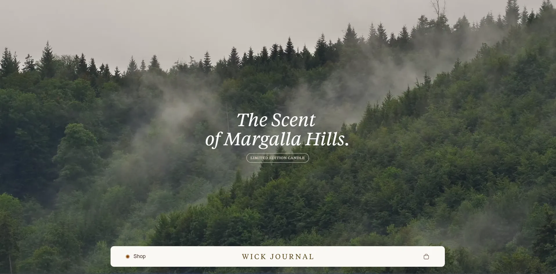
Artisanal candle e-commerce built around a feeling. Margalla Mist was inspired by the atmosphere of the Margalla Hills — a scent you experience in person, translated into a digital experience people can connect with.
The Challenge
This project started with something that's actually hard to define. A candle. Not just any candle, but one built around a feeling. Margalla Mist was inspired by the atmosphere of the Margalla Hills in Islamabad — the kind of thing you experience in person, not something you easily explain on a screen. And that's where the problem was. How do you take something sensory, something subtle like scent, and translate it into a website that people can understand and connect with? Most ecommerce sites don't even try. They list the product, add a few images, maybe a description, and that's it. But that approach wouldn't work here.
The Solution
The goal wasn't to just "build a store." It was to build a feeling. We wanted the site to feel calm, minimal, and intentional — something that reflects the product itself instead of overwhelming it. The flow was simple in theory: Land → understand the brand → feel the story → see the product → buy. No friction. No noise. Just a clear path.
Strategy & Approach
The entire site was built from scratch using Shopify's Liquid framework. We wanted full control over how everything feels and performs. Most themes come with a lot of unnecessary layers, and that goes against the kind of experience this needed. The structure is minimal. The sections are spaced out. Typography and imagery do most of the work. Nothing is there just for decoration — everything was kept tight and intentional.
Visual Direction
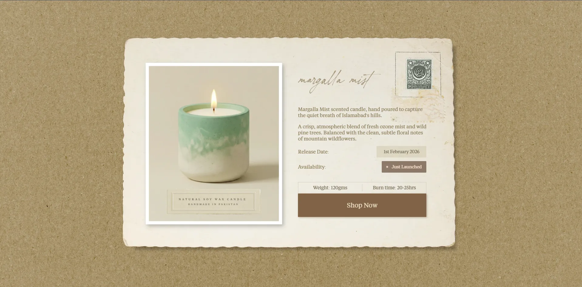
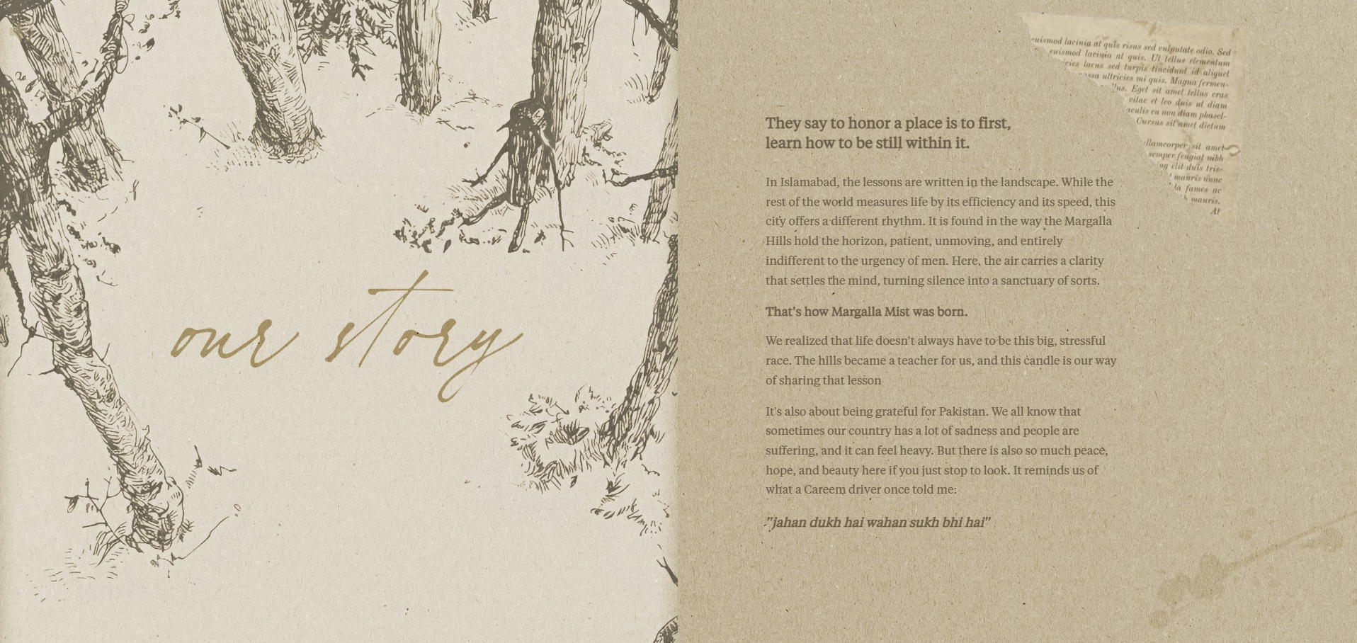
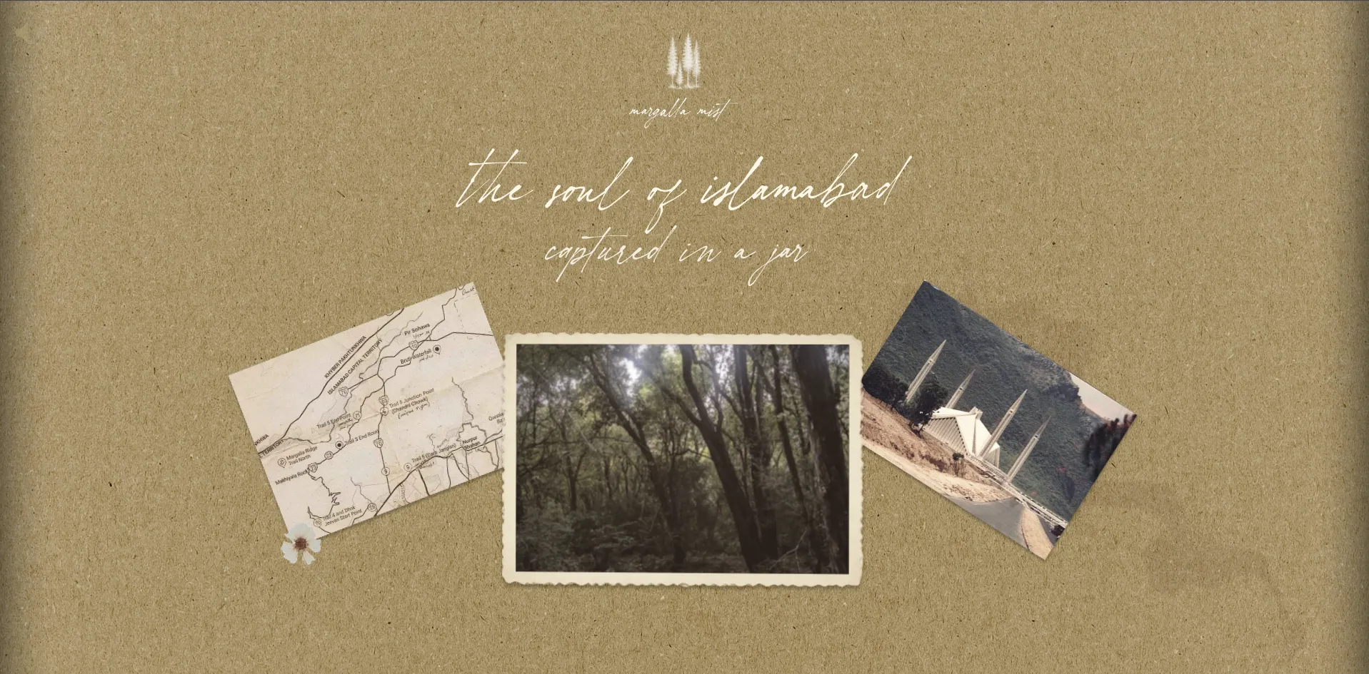
One of the biggest decisions was how to present the product itself. Instead of treating it like a standard product page, we built it around context — sections covering inspiration, scent notes, and the feeling it's meant to create. This shifts the perception. It's no longer just a candle sitting on a page. It becomes something you start to imagine before you even buy it.
User Experience
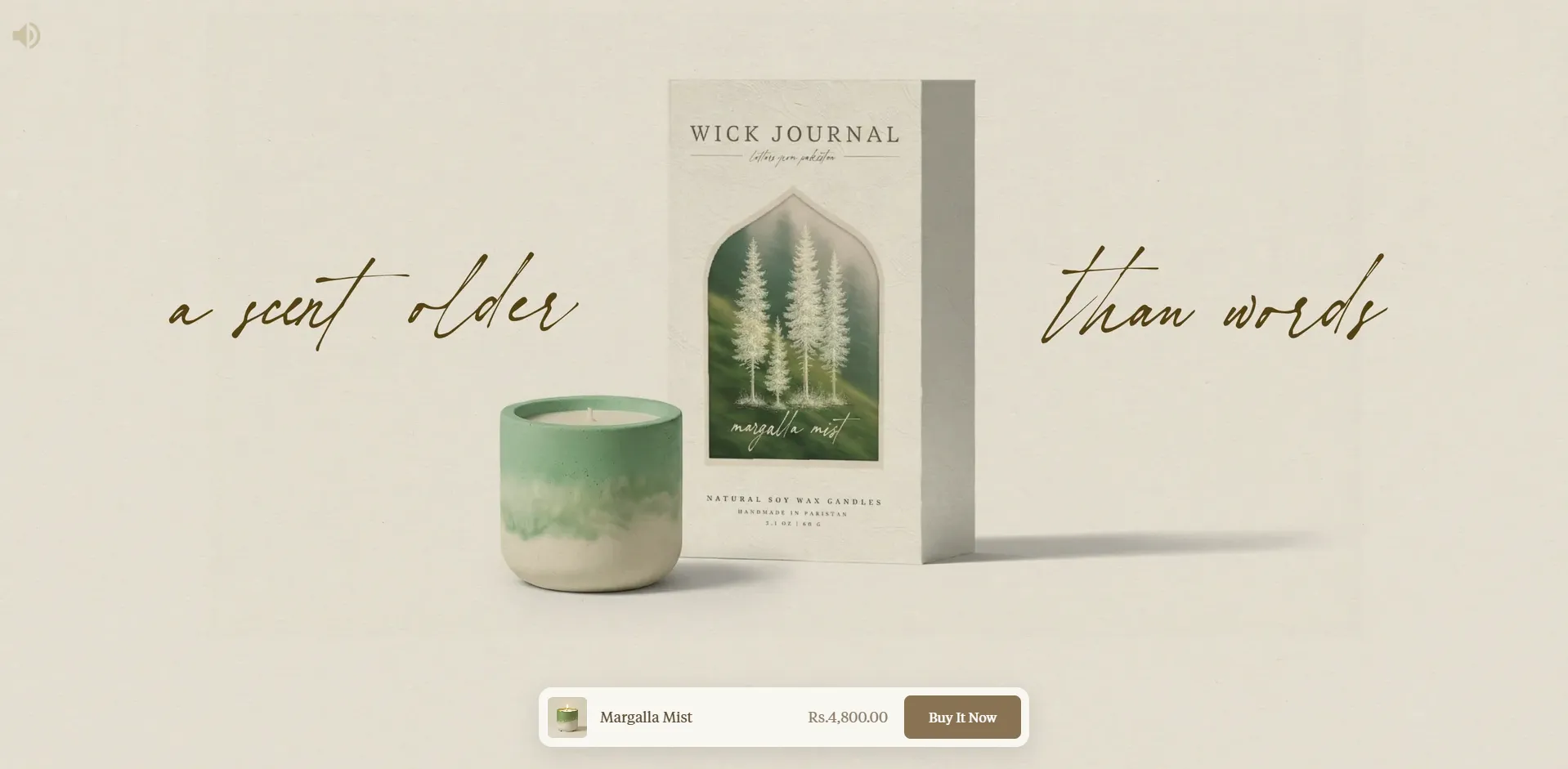
The homepage uses a structured scroll where each section takes up the full screen. You move through it step by step instead of skimming everything at once. It creates a rhythm — almost like you're going through scenes instead of scrolling a page. The flow was designed around a single principle: let the product breathe. Each section earns its place before the next one appears.
Interaction & Motion
We didn't want heavy animations, but also didn't want it to feel static. The approach was subtle: soft entrance animations, controlled reveals, smooth transitions between sections. Just enough to create atmosphere without overdoing it. Minimal motion videos add texture without weight. The interaction layer is felt more than seen — which is exactly what the product needed.
Development
Underneath the simplicity, there's a lot going on. Working with Shopify Liquid and CLI gives full control over how things are structured. We kept the build lightweight by reducing unnecessary scripts, optimizing assets into modern formats, and making sure everything loads quickly. Lighthouse was used consistently to check performance. Cloudflare handles delivery, keeping everything responsive without heavy workarounds. The goal was simple: keep it visually refined, but technically efficient.
Challenges
The hardest part wasn't coding. It was balance. Add too much and you lose the calm, premium feel. Add too little and it starts to feel empty. On top of that, we were trying to represent something people can't see or touch through a screen. The solution was a mix of subtle textures, controlled spacing, and minimal motion — just enough to create atmosphere without overdoing it.
Execution & Timeline
The project was built from scratch using Shopify Liquid with Cloudflare for delivery. Performance was tracked throughout using Lighthouse. The product page was treated as an editorial experience rather than a standard ecommerce template — each section hand-crafted to serve the story.
Results
Most Shopify stores just edit templates. This didn't. Everything here was built intentionally from the ground up. The experience came first, and the structure followed. That's why it doesn't feel like a typical ecommerce site — it feels more controlled, more focused, and more aligned with the product itself.
Avg Order Value
Premium positioning achieved
Return Rate
Customer satisfaction score
Social Engagement
Brand storytelling impact
Minimalist Poetry. The design reflects the artisanal, handcrafted nature of the candles with plenty of breathing room, elegant typography, and subtle interactions. The aesthetic is clean and contemplative, allowing the product stories to take centre stage.
Typography
Headlines
Classic serif font that adds elegance and literary quality to brand storytelling.
Body Text
Clean, modern sans-serif for product details and functional interface elements.
Color Palette
Ivory
Background
Soft Black
Primary Text
Wax Brown
Accent color
Beige
Supporting elements
This project reinforced something simple. Not every product needs more features or complexity. Sometimes, it just needs the right environment — something that lets it exist properly online. Right now it's centred around a single product, but it's built to grow. New scents, new stories, new products can be added without breaking the flow. The foundation is already there.